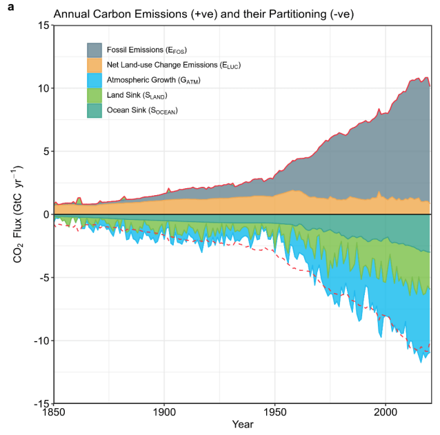
It’s Earth Day and to mark the occasion I wanted to share three graphics that I’ve found particularly useful for communicating our understanding of the current state of the carbon balance and our options for the future. The first comes from the Global Carbon Budget (Friedlingstein et al., 2021) and illustrates the sinks, sources and stocks of carbon.

We see that the contributions of biosphere and ocean to carbon uptake are of similar magnitudes and together they compensate around half of the carbon emissions caused by fossil fuel use and land-use change. The net land-use change emissions are the main factor we can directly influence, besides reduction of fossil fuel use, through reduction of deforestation and to a lesser extent afforestation, among others.
Such reductions are plausible, as highlighted very well in the following graphic from the latest IPCC assessment report:
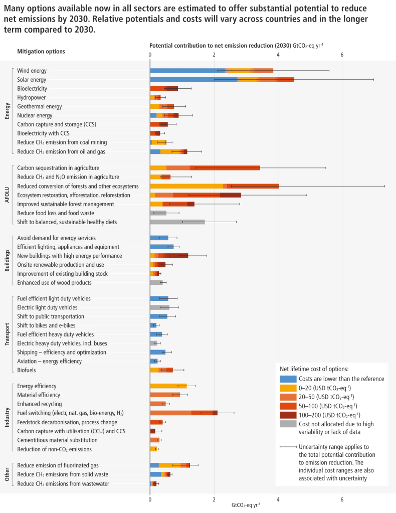
Besides showing the striking potential of renewables to reduce emissions by 2030, the graph shows that the reduction in forest conversion is another relatively inexpensive method to meet emission goals that are constantly moving further out of reach.
Finally, another important attribute of the natural land and ocean sinks is that they are both increasing along with atmospheric CO2 concentration. The land sink increases mainly due to vegetation being more productive in general when more CO2 is available, an effect called CO2 fertilisation. The ocean sinks are increasing, as higher CO2 in the atmosphere means more is dissolved in surface water that may sink and store CO2 in the deep ocean for long time periods. However, these sinks are unlikely to increase forever due to other limiting factors and the question remains when, how and where this saturation will occur. This is where the efforts of ecosystem scientists will prove invaluable for projecting future scenarios.